Improve Sickle Cell Patients Health Journey
As a solo UX & UI Designer, my job was...
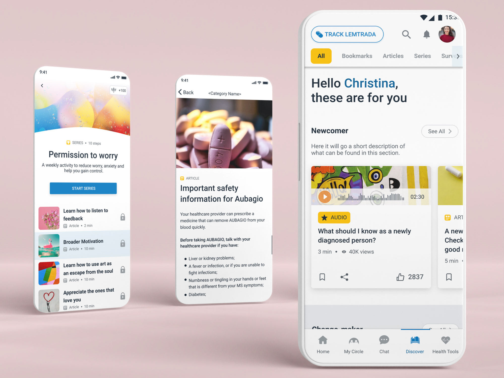
To replicate our main healthcare app with branded colors and adapt it to Sickle Cell patients, which involved user research and development of new features.
Patients with Sickle Cell Anemia struggled with:
📍 Lack of pain crises management tools
📍 Doctors and nurses at the Emergency Room thinking they were drug addicts asking for pain killers
📍 Pain crises triggered by sudden weather changes
📍 Racism at the ER because most people with this condition were African Americans
📍 Doctors and nurses at the Emergency Room thinking they were drug addicts asking for pain killers
📍 Pain crises triggered by sudden weather changes
📍 Racism at the ER because most people with this condition were African Americans
I used Double Diamond framework for this project

Phase 1: Discover
👉 Secondary research to better comprehend what these patients struggle with. I compiled all my research in a Miro board. My methods usually combine a Google search and joining communities in discord, reddit or facebook.
👉 I also analyzed the competition and separated the good and the bad from each competitor.
👉 Primary research based on frequent group interviews to empathize with patients and to talk about design concepts.
Phase 2: Define
👉 Based on the material gathered, I created a Persona and started thinking of that persona's personality and pain points to guide me.
👉 The Engagement Lead at the time made the decisions of which features we were going to move forward with:
- A Health Passport to bring patient's health records in one place.
- Trackers to measure pain intensity, location, visit to the hospital, medication taken, weather stats, sleep quality, stress intensity, and mood.
- Weather and Hospital Alerts to notify users about sudden weather changes so they could be prepared to prevent a potential upcoming pain crisis.
👉 Discussions about Privacy and Health Regulations helped us define what we could/could not do. We had a Privacy Expert in the team available for questions at any time. This expert also educated us every year about Privacy concerns.
👉 Discussions about Privacy and Health Regulations were part of the process the whole time. We have a Privacy Expert in the team available for questions at any time. This expert also educated us every year about Privacy concerns.
👉 I created a sitemap of how the app structure would like with all these new additions to our main app.
👉 I created a sitemap of how the app structure would like with all these new additions to our main app.
👉 I created the ideal User Journey Map that was updated later with the screens to send to the client's team.
Phase 3: Develop
👉 Before starting to design, I usually grab pen & paper to translate the concept in my head and explore all the questions around the decisions.
👉 I used Miro for User flows.
👉 Some wireframes were done in Miro and then I move to Figma to start working on the mockups.
👉 I chose to create high fidelity prototypes to get more accurate feedback on the design choices. There were a lot of updates based on client and users feedback.
👉 Some wireframes were done in Miro and then I move to Figma to start working on the mockups.
👉 I chose to create high fidelity prototypes to get more accurate feedback on the design choices. There were a lot of updates based on client and users feedback.
👉 Time for UI! Mockups and Prototypes were put into place.
👉 Illustrations were also done by me at the time.
👉 Illustrations were also done by me at the time.
Phase 4: Deliver
👉 My handoff to developers was mostly in Figma. I usually leave notes in Figma for the developers to know how certain components behave, and we have meetings to talk about the flows that are also presented in Figma (sometimes in Miro).
👉 I also had a Design System in Figma so developers could see all component states. Most times, I even create a grid to explain how the components must behave in certain situations.
Extra: App Globalization
After a year, the client wanted to start expanding the app to other countries, so we started a localization process.
✅ The localization process started in a complex way that involved sharing xml and excel files with the translator to get the app translated. We started using Lokalise as a localization tool, which improved the process.
✅ Curious Fact: For Saudi Arabia, we had to make 2 separate apps, 1 for female and another for men, as per client request. The language was different for female and male, so we had to treat translations as 2 different apps. The most interesting part was seeing the text and navigation from right to left.
Thank you! Feel free to ask any questions you might have.


